
 النسخة العربيه
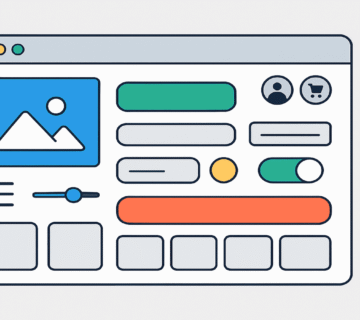
How Responsive Web Design Helps You Attract More Customers
Introduction to Responsive Web Design
Responsive web design is the process of developing websites in a way that ensures compatibility across a variety of devices and screen types—mobile phones, tablets, and desktops. In our current age, where many people rely on mobile devices to access online information and services, responsive design has become more important than ever. It helps ensure that visitors have a comfortable and seamless experience regardless of the device they use.
Responsive design requires adapting content and interactive elements so they fit different screen sizes. For example, images and text may need to be resized or rearranged so that visitors can read content easily and understand it better. Also, responsive design can improve the flow and navigation of users through the site more effectively, reducing bounce rates and increasing time spent interacting.
It’s also important to understand the difference between traditional sites and responsive sites. Traditional sites often use a fixed layout that might look great on a desktop but break or become unusable on other devices. Responsive sites adapt effectively to all screen sizes, which increases the likelihood of attracting visitors and improving their user experience.
In the end, responsive design is a core element in successful digital marketing strategies, as it ensures the diverse needs of a wide and ever-changing audience are met.
The Importance of User Experience
User experience (UX) is one of the foundational factors that help attract and retain customers. In the digital age, users expect a high level of interactivity, and user interfaces play a crucial role in meeting those expectations. Responsive design is a technological approach that aims to equip sites to fit various screen sizes, ensuring that content is displayed in an efficient, comfortable way. By improving UX, companies can enhance customer engagement, leading to higher conversion rates.
Page load speed is one of the prominent factors contributing to UX. If pages load slowly, users are likely to leave before they even see the content. Improving load speed typically involves techniques like reducing image sizes, compressing files, and using advanced networks. These technological aspects directly affect how customers perceive the site and contribute to improving their journey online.
Ease of navigation is also a vital aspect of UX. Menus must be clear and easy to use, allowing customers to find the information they seek quickly. Through responsive design, visitors can move seamlessly across different pages whether they use smartphones or computers. Organizing content logically makes it easier for them to find what they want and increases the likelihood of their returning. Therefore, designing a site that enhances UX is an effective investment for attracting new customers and fostering loyalty to the brand.

SEO & Responsive Design
Search Engine Optimization (SEO) is a fundamental part of digital marketing strategy, directly affecting visibility in search results. When we examine how responsive design influences SEO, we see that this type of design provides a consistent user experience across different devices—smartphones, tablets, or desktops. This consistency improves dwell time and engagement, which leads to lower bounce rates and greater interaction—factors that search engines view positively.
A responsive site means that content automatically adjusts to the screen size used, making it easier for users to access information with less effort. Search engines such as Google prioritize responsive websites because they can index content more effectively and adjust for screen size, boosting the ability to appear in top results. Moreover, Google increasingly uses metrics in search results to deliver better user experiences, and responsive sites reflect this trend by offering designs and services that avoid confusion across devices.
Additionally, responsive sites tend to load pages faster on various devices. Load speed is a critical ranking factor—search engines favor pages that deliver a smooth browsing experience. By improving load speed and performance across all devices, better SEO outcomes can follow. Thus, it’s clear that responsive design is not only user‑friendly but also a strategic SEO investment to enhance visibility and attract more customers.
Expanding User Reach
Responsive web design is vital in our digital era, where more users browse the internet via a variety of devices—smartphones, tablets, and computers. Responsive design provides an excellent user experience and clearly increases accessibility for users.
Even though many sites were originally designed for desktops, responsive design ensures content appears well and clearly on all devices, enabling users to access the information they need.
One key benefit of responsive design is the ability to adapt layout and size according to the screen being used. If a company’s site forces users to constantly zoom or scroll just to read content, that leads to a poor browsing experience and lowers the chance of user interaction. With responsive design, users can view information clearly and with ease, which increases engagement and encourages them to take positive actions—such as filling out a form or making a purchase.
Furthermore, SEO is an integral part of responsive site design. Since search engines like Google prioritize responsive sites in search results, responsive design enhances how many users can reach a site. These sites appeal to all types of users uniformly, allowing them to interact with content smoothly whether they use a phone or a desktop. Because of these features, responsive design is one of the most powerful tools for achieving digital success.
Costs of Responsive Design
The costs of responsive web design are an important consideration for businesses when developing their digital presence. While the initial cost to create a responsive site may be slightly higher compared to traditional (non‑responsive) designs, the long‑term benefits are significant. Responsive sites incorporate design features that allow content to be presented appropriately across devices—from mobile phones to desktops.
One of the main advantages of responsive design is efficiency in meeting user needs. It enhances user experience, which can lead to higher conversion rates and thus greater revenue. When using a responsive design, there’s a reduced need to create and maintain two separate websites—one for mobile and one for desktop. That means savings in hosting, maintenance, and development costs.
Regarding maintenance, responsive sites typically require fewer updates and less maintenance than separate traditional counterparts. Updates and changes can be applied once, reducing the time and resources needed to keep the site in good shape. Over time, these initial investments contribute to lower costs, making responsive design a wise choice for businesses wanting to strengthen their digital presence. The ultimate goal is to enhance financial efficiency, which makes responsive design an appealing solution for any organization aiming to stay ahead in a rapidly evolving market.
Companies That Benefited from Responsive Design
In recent years, many companies have adopted responsive design as part of their digital strategy, significantly improving performance and market competitiveness. By studying case examples of such companies, one can discern the considerable advantages brought by responsive design.
One notable example is Zara, which updated its site to be compatible with all devices. After implementing responsive design, they observed a 25% increase in online sales. By ensuring a smooth user experience on smartphones and tablets, Zara was able to appeal to a broader customer segment, improving its relationship with customers.
Another successful case is The Home Depot, where site redesign improvements led to a noticeable increase in visitors and sales. The company leveraged responsive design to provide a more flexible user experience, enabling them to reach a wider customer base and increase online engagement. Reports indicate that in the year following the changes, the company recorded a 30% rise in online sales through a more unified and easier-to-use interface.
Additionally, Starbucks adopted responsive design in both its website and app. Through that, they enhanced customer loyalty by delivering a seamless experience. Data shows that their mobile ordering share increased by 50% post‑implementation. These results underscore the importance of responsive design in attracting customers and boosting sales.
These case studies demonstrate that responsive design is not a luxury but a necessity for any business seeking to remain competitive and improve performance. These experiences illustrate how responsive design can positively influence a company’s digital transformation.
How to Create a Responsive Design
A responsive website design is a key factor for success in any online business. To design an effective responsive site, you should follow several practical guidelines and strategies. The first step is choosing a suitable framework such as Bootstrap or Foundation, which provide helpful tools to streamline design and make development more efficient.
One essential aspect is understanding how content behaves in different user environments: smartphones, tablets, and computers. It’s important to build a flexible grid layout that lets page elements automatically adapt to various screen sizes. Using relative measurement units—like percentages—works better when screens change sizes.
Dimensions and images are also crucial. While using high-resolution images is important for attracting visitors, their sizes should be controlled to maintain fast load times. Techniques such as lazy loading (loading images only when needed) help optimize performance. Also, fonts should remain legible at all sizes, so using simple, well-spaced typefaces is recommended to avoid readability issues.
It’s also vital to have a clear and easy-to-use navigation system. Menu elements should remain interactive and usable regardless of screen resolution. Be sure to test the final design across various devices to ensure all features work correctly. Finally, continuously gather user feedback to improve UX and refine the responsive design’s effectiveness.
Future Trends in Responsive Design
Responsive web design is entering a new phase with evolving technologies and user behaviors. Modern trends emphasize personalized experiences and heightened interaction across devices. Artificial Intelligence (AI), for instance, is starting to influence web design by delivering immediate, tailored recommendations to users as they browse—boosting the chances of attracting more customers.
Moreover, web designers are increasingly using emerging technologies like augmented reality (AR) and virtual reality (VR) to deliver immersive interactions. These innovations not only make websites responsive but push them to new levels of engagement, leading to improved conversion and retention rates.
For example, applications using these technologies can showcase products in compelling ways that encourage users to interact more deeply with content.
On another note, social behavior patterns are shifting: many users prefer quick and effortless access to information. Designers must ensure that their websites are not only responsive, but also deliver smooth browsing across mobile and desktop. User‑centric web designs guarantee improved UX and greater effectiveness, which in turn reflects on future business success.
In conclusion, responsive design is more than a technical adaptation; it’s about delivering a unique experience that meets changing user needs. As innovation continues, web designers must think about how to integrate these trends and stay competitive in a fiercely contested world.
Conclusion: The Importance of Starting Today
In this article, we discussed many benefits of responsive web design and the importance of improving UX across various devices. Responsive design is a vital tool for attracting customers and increasing loyalty, as it helps provide a smooth experience regardless of the device used. This kind of design not only enhances UX but also positively impacts search engines—boosting visibility and bringing the site closer to targeted customers.
Additionally, responsive sites offer an advantage in accurately analyzing user interactions. Companies can use this data to better understand customer behavior and adapt their strategies accordingly. The more your site aligns with visitor preferences, the more opportunities you have to attract them and drive more sales.
Thus, it’s essential for businesses to adopt forward-looking thinking and embrace responsive design as soon as possible. Delaying improvement may lead to missing new opportunities crucial for business growth. In a fast‑changing world, responsive design is an investment that every company should prioritize. So, if you have considered updating your site to deliver the highest UX quality, don’t hesitate to take the necessary steps to begin this process today. Remember—time is the essence of success.


No comment