
 النسخة العربيه
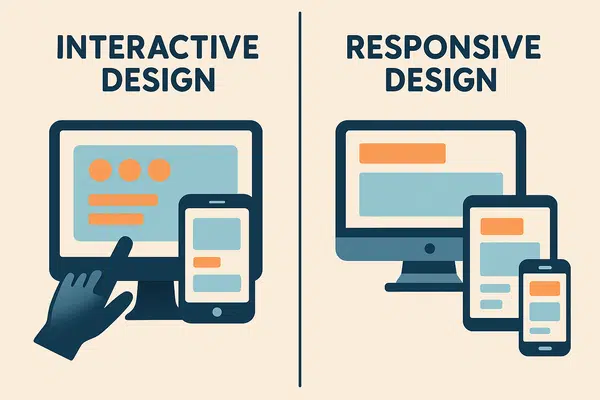
The Difference Between Interactive Design and Responsive Design
Introduction to Interactive and Responsive Design
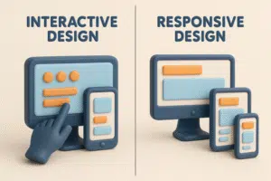
What is Interactive Design?
Interactive Design (IxD) refers to the process of designing the interaction between users and digital products or services, such as websites or applications. It focuses on creating engaging user interfaces that help users achieve their goals effectively and intuitively.
What is Responsive Design?
Responsive Web Design (RWD) is a web development approach that dynamically changes a website’s layout and appearance depending on the device’s screen size and orientation. Its primary goal is to ensure a seamless user experience across all types of devices.
Both interactive and responsive design are core components of modern user experience (UX). Each plays a unique role in how users engage with digital platforms.
Interactive design focuses on real-time interactions—like clickable buttons, visual feedback, and animations—that improve user engagement and immersion.
In contrast, responsive design ensures that content automatically adapts to different screen sizes, enhancing usability and accessibility regardless of the device.
While both contribute to improving UX, they serve different purposes: interactive design enhances engagement and behavior,
while responsive design ensures layout flexibility and adaptability. Understanding the distinction allows designers to build holistic digital experiences that align with user expectations in today’s fast-evolving tech landscape.
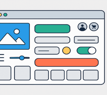
Key Features of Interactive Design
Interactive design is a fundamental principle in user interface development, emphasizing how users engage with software or devices.
Here are its most notable characteristics:
- Dynamic Interfaces: Includes elements like buttons, dropdown menus, and modals that empower users to interact easily and perform actions comfortably.
- Immediate Feedback: Systems should respond instantly to user inputs, offering visual or auditory cues (like notifications or animations) to confirm actions. This reduces confusion and improves satisfaction.
- Visual Effects & Animations: These elements make digital experiences more engaging. For example, subtle animations during scrolling or clicking can enhance the sense of responsiveness.
- User-Centric Interactions: Interactive design is especially valuable in eCommerce platforms or apps where users must make quick decisions. Providing instant information and actionable feedback helps improve conversions and customer satisfaction.
In essence, interactive design isn’t just a feature—it’s a necessity in creating modern, intuitive, and human-centered digital products.
Key Features of Responsive Design
Responsive design is an advanced design approach that ensures cross-device compatibility and a consistent experience.
Here are the key features:
- Flexible Grids & Layouts: Technologies like Flexbox and CSS Grid allow content to adjust fluidly based on screen dimensions.
- Relative Units: Using percentages rather than fixed pixels ensures elements scale naturally with the screen size.
- Media Queries: These CSS rules tailor the presentation of content for specific device characteristics (e.g., screen width), enabling adaptive styles.
- Improved Navigation: Responsive layouts eliminate horizontal scrolling, enhancing usability and increasing time-on-site.
- SEO Benefits: Search engines prioritize responsive sites in rankings because they offer a better overall experience.
To succeed with responsive design, developers must understand their target users and their devices, ensuring functionality and aesthetics are preserved across all platforms.
Future Trends in Interactive and Responsive Design
With the rapid pace of technology, both interactive and responsive design are evolving to meet new demands.
Emerging trends include:
- Artificial Intelligence & Machine Learning: These tools are enabling personalized user experiences, adapting interfaces dynamically based on behavior and preferences.
- AR/VR Integration: Augmented and virtual reality are creating immersive environments where users can interact with digital elements in novel ways, enhancing both engagement and exploration.
- Performance Optimization: As interactivity and responsiveness become more advanced, ensuring fast loading across all devices remains a priority. Efficiency is key to user satisfaction.
- Inclusive Design Practices: Accessibility is no longer optional. Designers are now incorporating universal design principles to ensure usability for users with disabilities.
- Continuous Testing: Ongoing usability testing and optimization are essential to maintaining quality and improving performance.
In conclusion, future-ready designers must adopt a flexible, innovative mindset. The convergence of interactive and responsive design lies in delivering seamless, engaging, and accessible experiences.
When combined, these approaches empower digital environments to serve users with efficiency, comfort, and inclusivity.


This is where ideas turn into impact! A great product design can change lives and markets alike